Case Studies
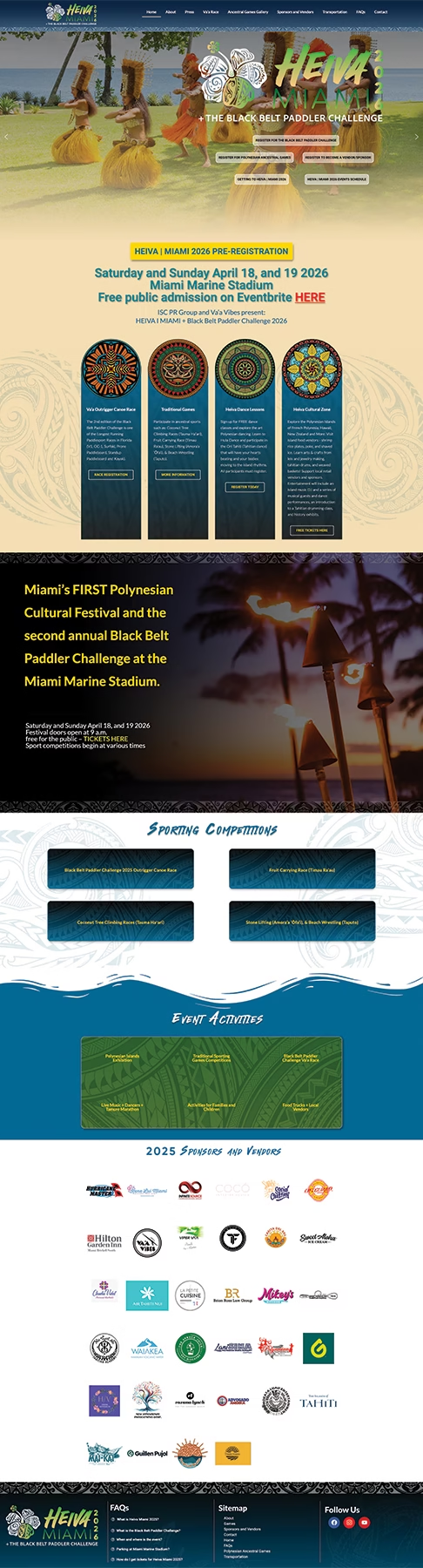
Heiva | Miami 2026
Client: HEIVA | Miami
Industry: Cultural Festival / Events / Entertainment
Services Provided: Web Design, UX Strategy, Visual Branding, Mobile Optimization, Content Architecture, Performance Optimization
Overview
HEIVA Miami needed a website that captured the energy, color, and cultural depth of their annual Polynesian dance festival. Their previous online presence did not reflect the scale of the event, lacked a clear information structure, and wasn’t optimized for mobile users — which mattered, because most attendees discover the event through social media and visit the site on their phones.
Creative Minds Studios was brought in to design a modern, immersive website that not only showcased the beauty of the festival but also streamlined information for performers, attendees, sponsors, and the wider community.
Goals
Create a visually striking digital identity that honors the Polynesian culture and aligns with HEIVA’s existing brand elements.
Improve navigation so visitors can quickly find schedules, ticket information, competition details, and vendor/sponsorship opportunities.
Deliver a clean, mobile-first experience built for high engagement and ease of use.
Build a flexible site the organizers can update as new festival announcements are released.
Key Features
Immersive Hero Section: Sets the tone immediately with culturally aligned imagery and strong visual impact.
Simplified Tickets/Registration Flow: Clear CTAs guide users to ticket options or participant registration.
Competition Information Hub: All categories, rules, and requirements are laid out cleanly for dancers and teams.
Vendor & Sponsor Pages: Professional layouts designed to help the festival attract partners and present value clearly.
Photo & Video Gallery: Brings the festival to life and gives new visitors a sense of the event’s vibrancy.
Contact & FAQ Tools: Reduce organizer workload by answering common questions upfront.
Outcome
The redesigned HEIVA Miami website delivers a polished, culturally aligned experience that elevates the festival’s online presence and supports their growing audience.
The site now:
Reflects the festival’s energy and authenticity
Makes it easier for visitors to find and act on event info
Creates a professional foundation for attracting sponsors and partners
Provides a scalable platform for future festivals
Strengthens HEIVA Miami’s brand identity across all channels
The project stands as a strong example of how purposeful design and strategic structure can transform an event website from “informational” to deeply experiential.
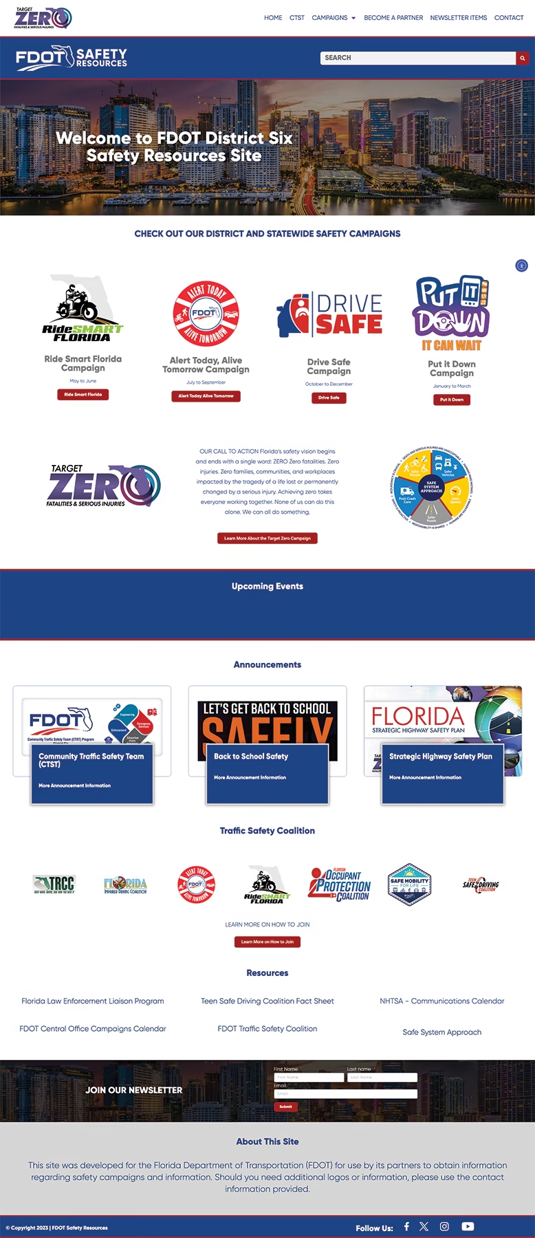
FDOT Safety Resources (District 6)
Client: FDOT Safety Resources (District 6)
Industry: Public Safety / Government / Community Outreach
Services Provided: Web Design & Development, UX & IA (information architecture), Content Organization, Responsive/Mobile Optimization, Campaign-Driven Content Structure
Project Overview
The FDOT Safety Resources site was built to serve as a central hub for statewide and district-level traffic-safety campaigns, resources, community traffic-safety teams (CTST), newsletters, partner sign-ups, and public outreach — covering multiple target audiences including motorists, families, community leaders, law-enforcement partners, and public safety stakeholders.
The goal: deliver a clean, easy-to-navigate, scalable website that makes safety campaigns accessible, informative, and clear for diverse audiences.
Challenges & Objectives
Complex content lifecycle & multiple campaigns: The site needed to support several ongoing and rotating safety campaigns (e.g. “Ride Smart Florida,” “Alert Today, Alive Tomorrow,” “Drive Safe,” “Put it Down,” “Operation S.T.R.I.D.E.”). Each campaign has different timelines, resources, and public-education assets.
Diverse user base & varying information needs: Users range from everyday drivers, parents, teen drivers, community advocates, to enforcement agencies — each needing different kinds of information (campaign dates, safety tips, coalition info, resources, ways to partner, etc.).
Clarity and accessibility: Public agencies must follow high standards for accessibility and clarity; the site must communicate important safety information clearly, and provide resources, contact info, coalition info, and signup functionality (e.g. newsletter, partner sign-up).
Scalability & maintainability: The site needed to be easy to update with new campaigns, announcements, newsletters, events, and resources — ideally without major redevelopment.
Outcome & Impact
The site acts as a single authoritative resource for traffic-safety campaigns in District 6 — reducing confusion and centralizing campaign info, resources, and contact points.
It supports multi-audience outreach — from everyday citizens (drivers, parents, teens) to institutional partners (schools, law enforcement, community orgs).
It enables campaign scalability and repetition — new campaigns, resources, and updates can be added without re-architecting the site.
It strengthens public trust & clarity — a professional, structured, clear site reflects well on FDOT’s outreach efforts, facilitating engagement and adoption.
Why This Project Matters
Public safety and outreach websites are often cluttered, outdated, or hard to navigate — which reduces impact and engagement. By delivering a clean, user-centric, campaign-driven, and easily maintainable site for FDOT Safety Resources, this project demonstrates how good web design and structure — when aligned with a social mission — can truly improve communication, outreach, and ultimately safety outcomes for an entire community.
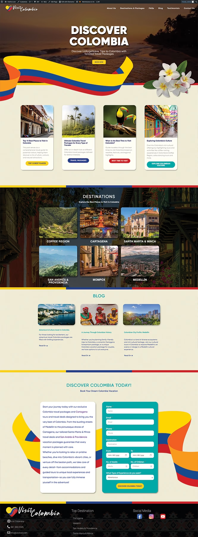
VisitCol.com — Travel & Tourism Website
Client: Visit Colombia (VisitCol.com)
Industry: Tourism / Travel Experiences
Services Delivered: Brand-Aligned Web Design, UX Strategy, Information Architecture, Conversion Design, Destination Showcase Design, Blog Layout, Mobile Optimization, Form Funnel Optimization
Project Overview
VisitCol.com was created to introduce travelers to the beauty, culture, and diverse destinations of Colombia. The brand needed a website that could instantly spark wanderlust, highlight key travel packages, and funnel visitors into inquiries and bookings. The site had to feel vibrant, trustworthy, and immersive, while also staying highly organized for users planning complex trips.
The result is a bold, polished travel website that blends emotional visual storytelling with clear, structured information architecture — giving travelers a seamless way to explore destinations, read travel insights, and plan their dream Colombia vacation.
Goals
Create an immersive first impression that captures Colombia’s energy, colors, and culture.
Showcase the top destinations in a clean, visual layout that’s easy to scan.
Educational content structure through a blog that positions VisitCol as a travel expert.
Convert travel interest into inquiries through a strategically placed booking form.
Ensure full mobile-first performance, knowing most travel research starts on phones.
Outcome
The VisitCol.com website now serves as a vibrant, trustworthy digital experience that positions Colombia as an irresistible destination. The design:
Builds immediate emotional connection with users
Simplifies trip planning through structured content
Drives inquiries via a strategic booking form
Showcases destinations with rich visuals
Establishes the brand as a professional, credible travel guide
This project demonstrates your ability to combine visual storytelling, UX strategy, and conversion design into a fully polished tourism website.